 Classic word processing with WordPerfect
For years, WordPerfect was the dominant word processor.
We were saddened to learn of the recent passing of Bruce Bastia, co-founder of WordPerfect. Bastia was the original developer and the co-founder of WordPerfect.
We wrote about WordPerfect on DOS in a “look back” article last year; unlike other systems at the time, WordPerfect didn’t use markup codes like WordStar did to change the formatting. Instead, WordPerfect presented the text on screen in a way that mimicked how it would appear on the printed page. This was a defining feature of WordPerfect, and made it ideal for office environments.
On a DOS screen, WordPerfect users saw the then-familiar white text on a blue background. The interface was minimal, with just the last line on the screen reserved to display information about the document, such as the filename and dimensions.
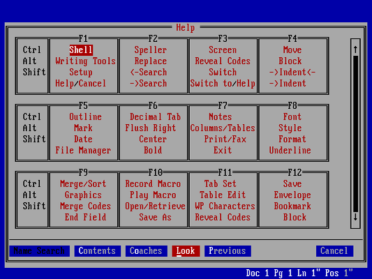
Early versions of WordPerfect used key combinations with the Function keys on the keyboard (F1 through F10 … and later, F1 through F12) to access features and create formatting. For example, press ctrl+F12 to save the file, or F7 to exit. Every copy of the software came with a keyboard template in the box, although later versions of WordPerfect could show the template via a “Help” menu:
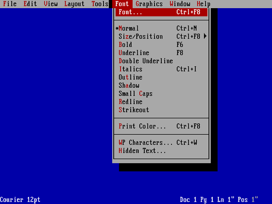
WordPerfect 5.1, released in 1989, was the first version to support a mouse-driven menu. This made the software more approachable for new users who might be unfamiliar with using the Function keys. The menu also made certain features directly accessible, such as formatting:
By default, WordPerfect on DOS ran in character mode, typically limited to 80 columns and 25 lines, although users could set the DOS display to use a different mode to display up to 50 lines. DOS text was limited to 16 colors and 8 background colors; a common way to display bold and italic text was to use colors, such as bright white for bold and a color like cyan or yellow for italic text.
Writing with style
The early versions of WordPerfect supported what we might consider basic formatting features, such as centering text, bold, and underline. But starting with version 5, WordPerfect added styles, a powerful feature for professional and technical writing.
With styles, an author could define their own custom styles to make documents look exactly how they wanted them to appear. For example, a technical writer might define a title style for the document’s title, and a heading style for major headings, both using a different font that helps them to stand out. The writer might also define a para1 style for the first paragraph after a title or heading - using double-spaced lines and full justification - and para for other body paragraphs with a temporary indent.
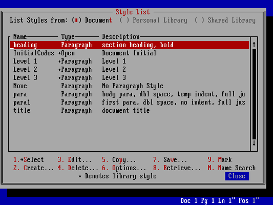
Using styles, it was easy to keep a long document looking consistent throughout. In this example, I’ve defined title for the title, para1 for the first block paragraph, and para for the first-line indented paragraph. Changing the style definition automatically updated the document with the new formatting:
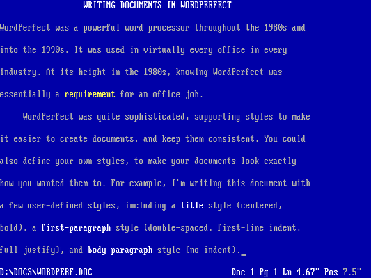
Reveal codes
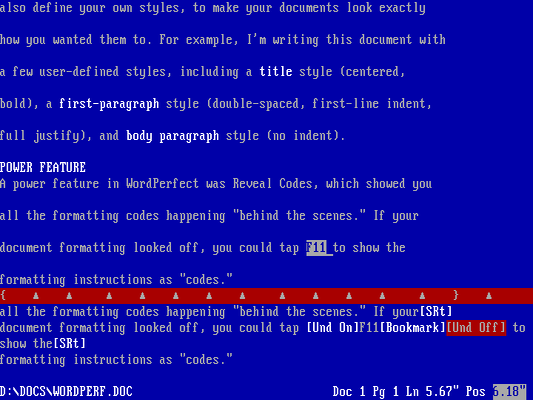
A power feature in WordPerfect was Reveal Codes, which showed you all the codes used to format your document “behind the scenes.” This was an important feature in WordPerfect, because tapping the wrong Function key might insert an unwanted formatting code. If your document formatting looked off, you could use F11 to display the formatting instructions as “codes” on the screen:
Using fonts
WordPerfect always had expansive support for different printers. In the early 1980s, desktop word processing usually targeted a dot matrix printer. But by the release of WordPerfect 5, laser printers had become inexpensive enough that offices provided a shared laser printer, and senior executives might have their own laser printer.
Dot matrix printers were essentially typewriter-like printers that generated text using a series of dots. Many popular dot matrix printers also supported alternate features including bold, double strike, and italic text. But these were all monospaced fonts, like a typewriter. With laser printers, documents might also use different fonts, such as Times and Helvetica.
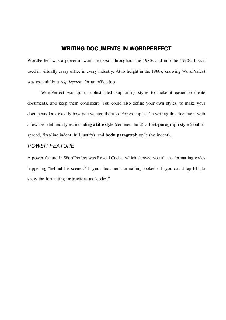
WordPerfect supported these variable width fonts, although the on-screen display was awkward when using the character mode of DOS, where every character was the same width. Adding fonts to a document caused text to “overflow” beyond the right “edge” of the screen. It was still representative of the printed page, but in a more abstract way:
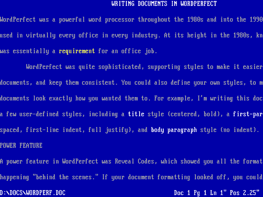
While this on-screen display wasn’t exactly perfect, it did allow an author to work with the text as it would later appear when printed:
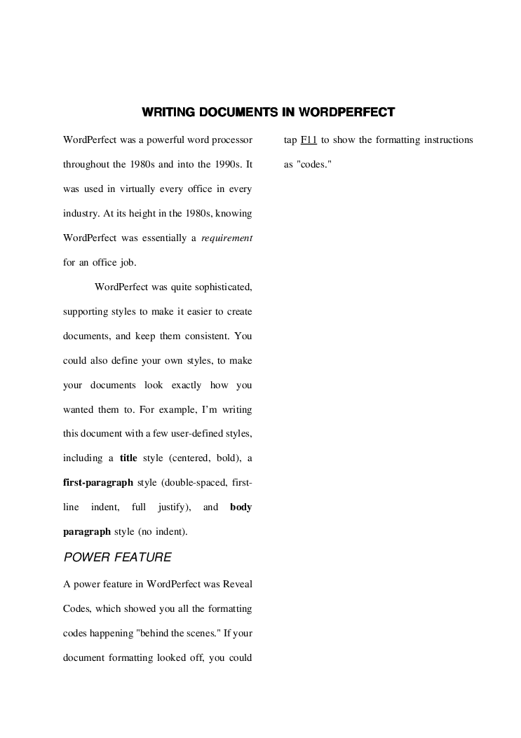
WordPerfect also supported advanced formatting such as columns, which allowed technical writers to create scientific documents, technical articles, or newsletters. The on-screen display makes this more difficult to work with when using character mode:
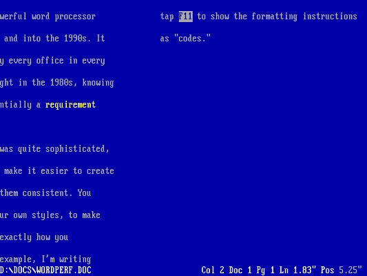
But it accurately represents how the document will appear in print, and that was a defining feature of WordPerfect.
We’ll always remember WordPerfect
For years, WordPerfect was the dominant word processor. There was a saying in the 1980s that if you knew how to use WordPerfect, you were guaranteed a job in any office. And while WordPerfect failed to grab the same market attention in the Windows era - it was displaced by Microsoft Word - WordPerfect remains a fond memory for many who used it. At Technically We Write, we’ll always remember WordPerfect as an important milestone in technical and professional writing, delivering a powerful word processor that anyone could use to create complex documents from the desktop.
