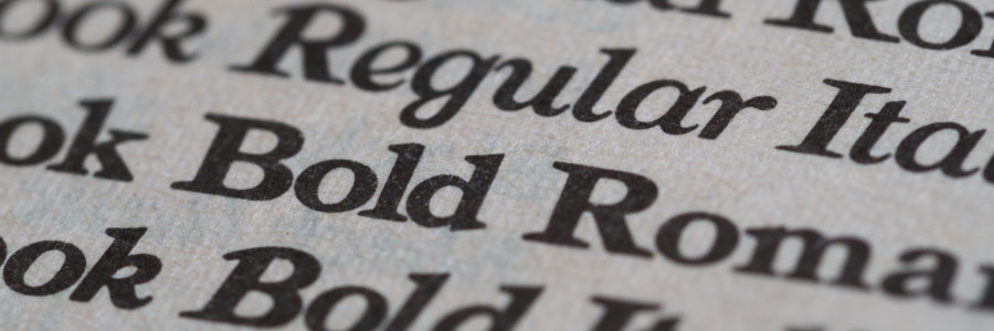
 What's your favorite font?
What's your favorite font for print? We asked our community to share their favorite picks.
These days, technical writers can choose from a variety of fonts, many of which are available for free from websites like Google Fonts. And of course, everyone has their favorite font for print or online materials. We polled our community to share their favorite fonts for print work:
Sans-serif fonts
Shareen Mann (The Write Mann) prefers a sans-serif font:
My favorite font for print is probably Tahoma with Arial as a backup. I studied journalism in high school and college, where serifed fonts were king, and they just hurt my eyes. I like something clean, without extra bits, for ease in reading.
Kim Huang likes sans-serif for accessibility:
There's a lot of talk amongst language nerds about the accessibility of languages and how typography can affect that. An example of that is serif versus sans-serif typeface, with the latter being thought of as more accessible to ESL readers. I prefer sans-serif fonts like Arial for that reason.
Seth Kenlon also prefers sans-serif:
I like Aneliza. It’s [predominantly] san-serif, so the glyphs are easy to recognise quickly (no overly fancy q or g, for instance). The lowercase L features a tail so that it can’t be confused with the digit 1 (which itself has serifs so it can’t be confused for a lowercase L). And the zero has a dot in the middle of it, so it can’t be confused for an uppercase O.
In practice, I find that the audience matters. In the tabletop roleplaying community, serif fonts (Andada and TeX Gyre Bonum, particularly) are very popular, so I often use those when publishing games. For screenwriting, Courier is required for timing purposes, so I use Courier Prime.
Ralf Quint also likes sans-serif fonts:
I use Arial or equivalent. I'm not a fan of serifs.
Serif fonts
Chris Hermansen likes Bembo, a serif font:
I've been a huge sucker for Bembo ever since I became acquainted with Edward Tufte's excellent works on graphics and information representation. But I guess I might not use it in a technical document, because the next step along that road is starting each section or chapter with a haiku.
Kelly McCullough prefers a timeless serif font:
Times New Roman—I'm a classicist.
Jim Hall adds:
I have experimented with several fonts. For print, I prefer to use serifs; I just find serif text easier to read on a printed page. I used to use EB Garamond, but a few years ago I switched over to Crimson Pro, which is a great looking font. It looks very professional in my print materials.
