 How many usability testers
How many testers do you need to get actionable results? The answer is "about five." Here's why.
When performing a usability test, you may think "more testers means better results." But that's not always the case.
In the usability tests I've led or mentored, the test examined an existing product that needed improvement. In these kinds of tests, the goal is to identify the rough areas in the design that trip up most users. With that data, the system owners can update the design.
Ideally, projects will go through several iterations of usability testing followed by design improvements. Such a cycle might look like this:
In my experience, most projects that follow an iterative process like this can usually arrive at a design that works well for almost everyone within about three iterations of testing and updates.
How many testers
Much has been written about how many testers you need for a usability test. In 2000, Nielsen Norman Group identified that usability tests might need only five testers. They updated their research in 2012 with the same results: most usability tests only need about five testers.
The minimum of about five testers carries the assumption that a project will perform several iterations of testing. At any one phase, the project only needs "actionable" results that are good enough to make changes for the next round. This kind of professional testing doesn't require the same rigor as an academic study.
This is not a new conclusion. Virzi identified in a 1992 study (Human Factors, 1992, 34(4), 457-468) that usability testing has a diminishing return with an increasing number of testers. Virzi concluded "Curves relating the proportion of problems detected to the number of subjects in an evaluation are approximated by the formula 1-(1-p)n," where p is the relative probability of a single tester uncovering issues in the design, and n is the number of testers.
Nielsen approximated p at about "31%, averaged across a large number of projects [NN Group] studied." Other studies (Perfetti) may suggest more testers for a very large project, but otherwise agree with iterative testing with different groups of testers.
Understanding the curve
The 1-(1-p)n approximation describes a curve of diminishing returns. Assuming p is about 31%, the curve looks like this:
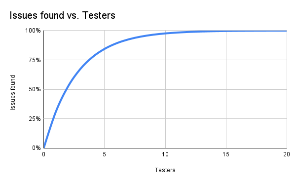
A few highlights of this curve:
- With zero testers, you get zero results. (Nielsen) You can't understand the usability issues in the system if you don't test it.
- More testers doesn't mean more results. There is some overlap in what issues each tester will uncover, which means adding more testers does not give more data.
Nielsen suggests about five testers, which is where the curve exceeds 80% (84.36%) of issues found. If the project follows an iterative process, that is sufficient data to provide actionable results for the next round of improvements.
Understanding the numbers
The result of "about five testers" may be easier to understand if we visualize the issues found. I created a simple Linux script to randomly place red squares on top of a larger gray field. Each of the red squares covers 31% of the overall area.
Every run of the program generates a new random pattern. Here is a series of program output for 1, 2, 3, 4, 5 and 10 iterations. Note that as we increase from 1 to 5 iterations, the red squares continue to overlap. This simulates the overlap of issues you can observe with an increasing number of testers in a usability test.
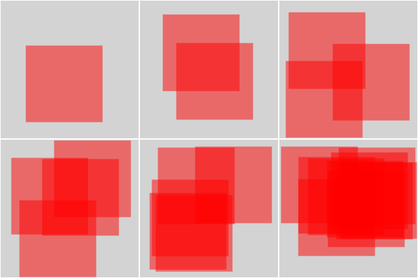
Compare the last two squares, representing 5 and 10 iterations. The image with 10 iterations covers more of the gray field than the image with 5 iterations, but not by a significant amount. More iterations generates diminishing returns after about 5 iterations.
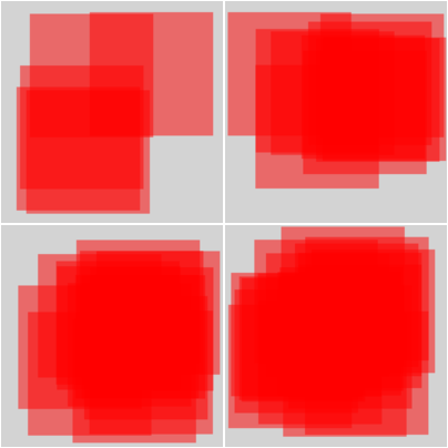
Consider this series of 5, 10, 15, and 20 iterations. Images with increasing iterations cover more of the gray field, but there is not much difference between 15 and 20.
You can generate your own images to observe the overlap. This Linux script generates a gray field that is 819 pixels on each side, and a number of randomly placed red squares each 465 pixels per side. That means each red square covers 31% of the field. The script creates an SVG image that you can view in a web browser.
#!/bin/bash

max=1
if [ $# -eq 1 ] ; then
  max="$1"
fi

cat<<EOF
<svg viewBox="0 0 819 819" xmlns="http://www.w3.org/2000/svg">
<rect x="0" y="0" width="819" height="819" style="fill:lightgray"/>
<!-- $max overlapping red squares -->
EOF

# iterate n-many red squares

# this assumes 819x819 gray square, and 456x456 red squares.
# the gray square has area 670761 and the red square has
# area 207936. That's 31.00001342% .. so basically L=31%.

# pick a starting x and y start value from 0-363 (that's 819-456)
# for each red square.

for n in $( seq 1 $max ) ; do
xrand=$(( $RANDOM % 363 ))
yrand=$(( $RANDOM % 363 ))

cat<<EOF
<rect x="$xrand" y="$yrand" width="456" height="456" style="fill:red;opacity:0.5"/>
EOF
done

cat<<EOF
</svg>
EOF
Save this script as square.sh and run it with the number of red squares as a command line argument. Without a number, the script generates a single square by default. For example, to generate images with 10, 15, and 20 red squares, use this Linux command line:
$ bash square.sh 10 > 10.svg
$ bash square.sh 15 > 15.svg
$ bash square.sh 20 > 20.svg
To generate an iteration of images with 1, 2, 3, 4, and 5 red squares, you can use this command line:
$ for n in $(seq 1 5) ; do bash square.sh $n > $n.svg ; done
Jim Hall is an open source software advocate and technical writer. At work, Jim is CEO of Hallmentum, an IT executive consulting company that provides hands-on IT Leadership training, workshops, and coaching.