 Analyzing usability tests with heat maps
How do you report the results of a usability test? Here's a visual way to share results.
After you've performed a usability test of an information product, you need to communicate what worked well and what were the challenges. The client needs to understand the areas that need the most focus so they can put their attention to fixing those rough spots for the next iteration of the product.
The standard way to report the results of a usability test is to write a prose document, providing an overview of what scenario tasks were easiest and which were most difficult for testers to complete. To support the findings, usability test reports should include quotes from testers, and screenshots of the tester's activity if applicable.
When I performed one of my first usability tests, during my Master's program more than ten years ago, I wasn't sure how to report my findings. The client I was working with seemed very interested in seeing the results, but there was a lot of data to share, and I wanted to avoid information overload.
I wanted to share my results in a new way. In addition to providing a written description of my findings, I applied information design to display my results in a new way.
The heat map method
I implemented an information display that I nicknamed a heat map or heat grid to show an overview of my test results. To create a heat map, I created a grid with scenario tasks on rows and testers represented in columns. The cell where a row (scenario task) and column (tester) meet captures the relative difficulty a tester experienced while completing that scenario task. I applied these rules to complete the grid:
- If the tester didn't have any issues completing a scenario task, I coded the cell in green
- If the tester experienced only minor hiccups in completing a scenario task, but the task was generally easy to complete, I coded the cell in yellow
- If the tester had moderate difficulty in completing a scenario task, such as getting lost a few times in the menus or not recognizing an icon right away, I coded the cell in orange
- If the tester had great difficulty in completing a scenario task, including clicking around or visiting the same menu or configuration screen multiple times - but eventually found the solution - then I coded the cell in red
- If the tester found the scenario task so difficult that they were unable to complete the task, I coded te cell in black
Any tasks that I chose to skip due to time were left blank (white) with a marker to indicate the scenario task was not attempted.
Analyzing a heat map
With these rules in place, I was able to generate a heat map that presented an overview of my results. Each row represents a scenario task, and includes a brief summary of the task; the full scenario task was included in the written report. Each column showed a different tester. Cells were coded by color to indicate difficulty.
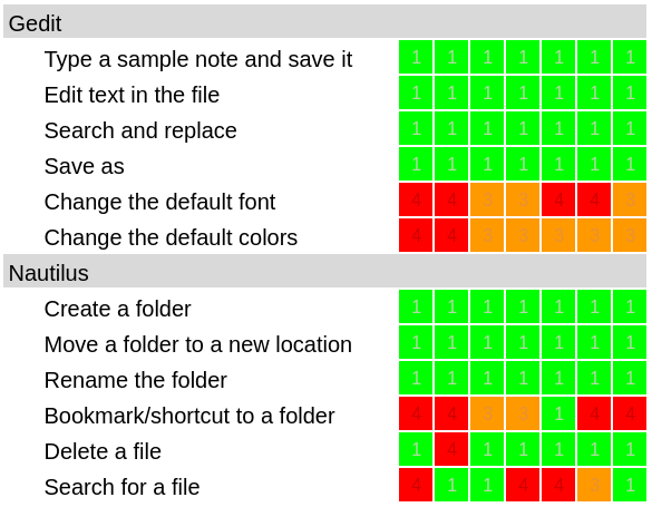
The heat map provides an overview of the test results. We can see that the usability test used seven testers. The usability tests for Gedit (a text editor) and Nautilus (a file manager) each involved six scenario tasks.
When I evaluated the heat map, I first looked for what I termed hot columns. A hot column would indicate a single tester that may have experienced some systemic problem during the test. I would need to refer to my test notes to determine if the tester was confused by the overall test or had hardware issues; in such a situation, I would likely discard the hot column. However, I didn't see any hot columns in the results.
I then look for hot and cool trends in the rows (scenario tasks). Cool rows such as rows that are entirely or predominantly green and yellow cells suggest scenario tasks that are consistently easy for testers. Hot rows with significant amounts of black, red, and orange cells indicate scenario tasks that were very difficult for testers.
From these test results, I suggested the client focus on changing the default font and changing the default colors in the text editor. The other tasks in the Gedit test were all cool rows.
Similarly, I recommended the client focus on bookmarking a folder location and searching for a file in the file manager. The other tasks for Nautilus were pretty easy. One tester had difficulty in deleting a file, but the data suggests that this may be an outlier.
Other heat maps
I have since used the heat map method in other usability tests, and recommended the use of heat maps in other usability tests that I've mentored or participated in. The feedback has been consistently positive; heat maps make it easy to spot trends in the data.
Here are the heat maps for two usability tests. These tests were performed by interns who were learning about usability testing. I served as their mentor, and recommended the heat map method to share their results.
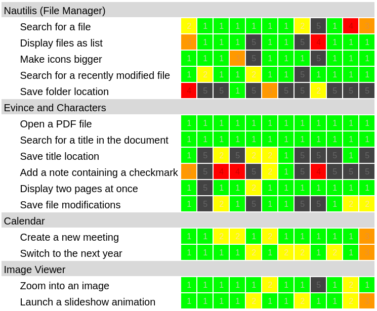
Gina D. performed this usability test of several GNOME applications using twelve testers. The data is consistent across most testers.
The heat grid shows several hot rows, suggesting the client address bookmarking a folder location in Nautilus (a file manager) and adding a note and saving a location in Evince (a PDF viewer). As a second priority, the client might also address saving file modifications in Evince. We did not recommend addressing the other rows, which were mostly cool rows.
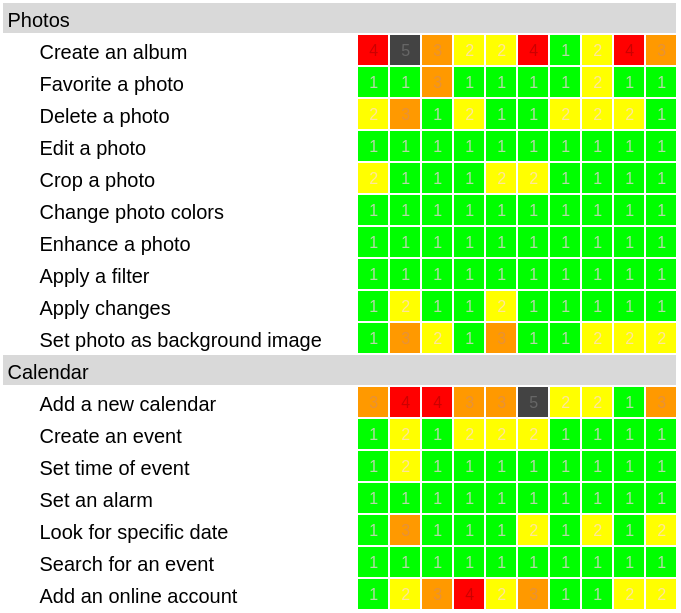
Renata G. designed and executed this usability test for two GNOME applications with ten testers. The results are consistent; we did not observe any hot columns.
The heat map shows a few hot rows. We recommended the client first focus on creating an album in the Photos app and adding a new calendar in the Calendar app. As a second priority, we suggested the client might also attend to adding an online account in Calendar and setting a photo as a background image in Photos.
Creating your own heat map
I find the heat map method provides a good overview of usability test results. Most clients can find the hot rows even before they understand the color coding system. This provides a foundation from which the usability test report can make recommendations and suggest priorities.
It's easy to create your own heat map. Use these tips to make a heat map of your next usability test results:
- Use rows to represent usability test scenario tasks
- Provide only a summary of the task; clients can refer to the written report for the full scenario task used in the test
- Use columns for each tester
- Set a color in each cell to indicate the relative difficulty for a tester to complete a task: █ easy █ not too easy █ harder █ more difficult █ too hard

Jim Hall is an open source software advocate and technical writer. At work, Jim is CEO of Hallmentum, an IT executive consulting company that provides hands-on IT Leadership training, workshops, and coaching.