 A mystery of document preparation
Dennis Ritchie's PhD thesis is a masterpiece of typography from a time when computer document preparation was in its infancy.
You may recognize Dennis Ritchie as the creator of the C programming language and as the co-creator of the Unix operating system. In 1968, Ritchie (also known by his login, dmr) was nearing the end of his PhD program. He had written his thesis and prepared his defense. Yet Ritchie never submitted his thesis; it remained on a shelf until his passing some 40 years later
Recently, Ritchie's thesis has been further explored for the incredible detail in typography. As his family explains on a website dedicated to Ritchie's work: the thesis "represents what is typographically one of the most sophisticated math dissertations of the 1960s, perfect placement of sub/superscripts and abundance of Greek letters and math symbols, and the uniformity from version to version."
(image: Bill Ritchie, used with permission)
In September, 2022, David Brailsford, Brian Kernighan and William Ritchie discussed dmr's thesis at ACM's DocEng22, an annual conference devoted to document engineering. I asked Brian Kernighan about dmr's thesis and why its production is so significant.
What was the standard way to write documents like this in the 1960s?
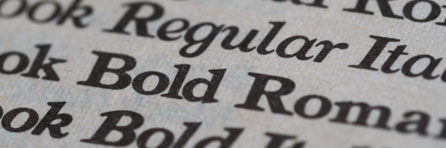
The state of the art for amateur typographers (that is, not professionals working for newspapers or book publishers) was pretty much Jerry Saltzer's RUNOFF or programs with about the same capabilities. These were just fine for ordinary text - anything that involved only letters and numbers at standard spacings. In effect these programs replicated what ordinary typewriters did.
Professionals doing newspapers and books could use Linotype machines, which handled proportional fonts - that is, fonts with different widths of letters - and do automatic line-justification. Linotypes were big, noisy, and hot, since they literally created lines of letters held together by lead that was cast on the spot, then reclaimed after a page was printed. But it was line at a time; anything involving fractional line spacing or special characters would not work.
Why was it so difficult to create printed documents with mathematics?
Even for professionals, mathematics was difficult, because there were multiple sizes and fonts of characters (subscripts and superscripts smaller than the main body of text and in italic, for example), other subtle positioning requirements (subscripts moved down a fraction of a line, superscripts above the subscripts somewhat), built-up characters like tall brackets, horizontal lines for fractions, and of course lots and lots of different characters, including Greek letters and mathematical symbols like integral signs.
(image: Bill Ritchie, used with permission)
Putting those together into a printed page was very slow and tedious, since it was basically done one letter at a time - no automation at all. Mathematics was called "penalty copy" in the trade, because it cost so much to produce.
What makes this thesis special?
The thesis itself is about recursive function theory. I am absolutely not an expert on this, so take what I say with a big grain of salt. But basically what Dennis showed was that a model of computation based just on loops and simple X=X+1 operations was equivalent in what it could compute to other standard models like Turing machines. I will guess that this was of theoretical interest but not in any way of practical interest.
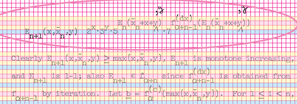
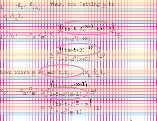
The typographical aspect is the other interesting bit. If you look at almost any random page of the thesis, it's replete with mathematics, often multiple levels of subscripts and superscripts with their own subscripts and superscripts. There are often sequences of such expressions neatly aligned on equal signs. And a fair number of special characters, often Greek but sometimes Fraktur letters, summations, and so on. It's typographically complicated.
Could it have been typed by a human on a then-current typewriter? Maybe so, though there are fractional horizontal motions that seem unlikely. More significantly, the positioning is very accurate and uniform throughout, to a degree that seems like it would have been quite hard to maintain by hand. And it's almost free of errors.
(image: Brian Kernighan, used with permission)
All of this suggests some kind of computer-controlled typing process. But we don't know what hardware for sure (though we think an IBM 2741 terminal, basically a computer-controlled Selectric typewriter) and we definitely don't know what software was used, if indeed there was software control. It looks like the fonts correspond to an available Selectric typeball, though it's not clear how some of the special characters were handled - another typeball?
How do you think the thesis was produced?
I think it's fair to say that we still don't know for sure how the thesis was produced; there are still a bunch of open questions. I'm not sure that we will ever know for sure. If any of your readers have insights, we would be happy to hear them.
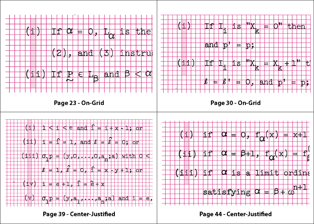
You're creating a canonical bitmap PDF file of the original 180-page thesis. How are you doing that?
All of this part has been done by Dave Brailsford. He's been using the standard tools like troff (not groff, though that would have been a fine alternative), eqn, tbl and pic, along with a standard macro package and some extra macros.
Since Dennis's thesis was produced on some kind of typewriter-like device, Dave is not taking advantage of any of the troff facilities for proportionally-spaced fonts - it's all mono-space, and all vertical motions are multiples of half a line. This means that in effect it's using troff in its nroff mode. There are a few places where tbl is used to get an alignment like the original, and there is at least one full-page pic diagram where the lines must have been hand-drawn in the original.
The reconstruction process has been somewhat on hold for the past few months. I think that one "discovery" was that it's incredibly hard to be totally accurate in transcribing this kind of mathematics; the fact that there are so few errors in the original strongly suggests some combination of exceptional attention to detail (which was certainly one of Dennis's characteristics) and probably some kind of mechanical process to avoid the errors that would inevitably creep in if there was much retyping.
It's still a collection of interesting mysteries.
Thanks to Brian Kernighan for a fascinating view into how this technical document was constructed. For more information about the thesis, visit dmrthesis.net and www.cs.princeton.edu/~bwk/dmr

Jim Hall is an open source software advocate and technical writer. At work, Jim is CEO of Hallmentum, an IT executive consulting company that provides hands-on IT Leadership training, workshops, and coaching.