 Consider your fonts
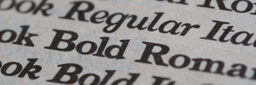
A sans-serif font can project modern and new, while a serif font often suggests tradition and formality.
Your words convey only part of the message. Readers infer other parts of your message or apply other meaning based on visual clues about how the document is written. These clues can include colors, arrangement, and fonts.
Consider the font
Let's start with an example of a "cease and desist" letter written by an attorney. As a printed document mailed to a recipient to formally insist that an action or behavior stop, this document must convey authority to the recipient.
The choice of font is just as important as the message in the letter. A handwritten font like Caveat, Comic Neue, or MS Comic Sans erodes that authority; the letter will appear childlike.
That same letter written in a serif font such as Garamond or Times will evoke feelings of tradition. For a formal demand such as a cease and desist, a serif font might be the right choice.
My caveat might be that if the cease and desist were written by attorneys working for a social media company, or some other high-technology firm, a sans-serif font such as Arial or Open Sans might be preferable. The sans-serif font suggests modernity and clarity, typical of technology organizations.
Sample fonts
Allow me to demonstrate how the right choice of font can carry meaning to the reader. I have selected several popular font samples from Google Fonts, the online warehouse of free fonts:
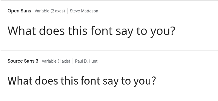
Open Sans and Source Sans are two popular sans-serif fonts. Open Sans uses a round, open font style that makes it easy to read on screens. Source Sans provides a similar shape with a slightly more condensed appearance. Both represent a modern, clean message.
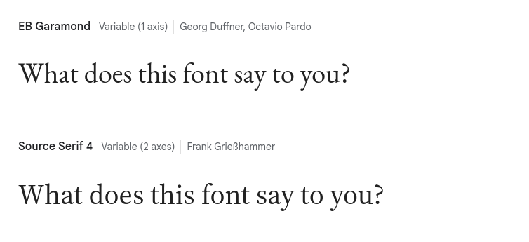
EB Garamond and Source Serif are popular serif fonts, often recommended for print projects. EB Garamond is a modern variation on the classic Garamond font, which has remained largely unchanged over many decades. Source Serif borrows many of the same elements from Garamond, but with a wider, more open appearance. Notably, Source Serif's italic style is more consistent with its standard roman style.
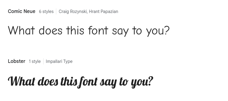
Comic Neue and Lobster are both fantasy-style fonts. As you might guess by the name, Comic Neue is a "comic" style font that emulates the hand lettering in comic books. Lobster has an overly formal appearance, perhaps typical of wedding invitations.
Be careful about using either font. Most organizations look down on using a "comic" font for any professional communication, with the view that it "takes down" the communication to a child-like level. At one organization I know, the Communications Director sometimes used the phrase, "We're a multibillion dollar org, we shouldn't use MS Comic Sans." [MS Comic Sans is another "comic" font on systems running Microsoft Windows.]
I caution against using Lobster for different reasons. This font is sometimes used as the title or heading font, to help establish a more formal tone. But the shapes and connected letters actually makes this font difficult for readers with diminished vision. The font is not very accessible and excludes part of your audience.
Our choice of font can say a lot about us. A sans-serif font can project modern and new, while a serif font often suggests tradition and formality. Similarly, a fantasy font such as a handwritten font style, implies informality. As technical communicators, we need to consider our font as part of our message, rather than just how the text appears.

Jim Hall is an open source software advocate and technical writer. At work, Jim is CEO of Hallmentum, an IT executive consulting company that provides hands-on IT Leadership training, workshops, and coaching.