 Add map-making to your technical writing skills
Information design elements can make information more clear to your readers. Here's how to add maps to technical documents.
I have written quite a few technical documents over the course of my career. Many of these have been project proposals or project reports. Aside from requiring clear and concise prose, these documents often needed illustrations of various sorts: tables, graphs, images and so forth. And as well, very often, maps.
Because of the particular nature of my work, I have had some experience with making maps since the mid 1980s. I have seen the evolution of map-making software and hardware, and with the improved capabilities of both, improvements in techniques of map-making. Today, there is a tendency to subsume map-making into the broad topic of "data visualization"—and while reasonable in some ways, this does not do justice to the rich legacy of cartography down through the ages. I have also seen many documents that should have included maps but did not. While there may be documents including gratuitous maps, I haven’t yet encountered them; possibly because making maps requires specific knowhow.
I hope to encourage technical writers to consider whether the project at hand would be better with a map, and therefore whether it might be useful to learn something of map-making in order to create higher-value products. Based on my experience, writing professionals may find that the only person on the team who knows how to make maps has the inside edge for picking up the best assignments.
Why make maps?
Would-be map-makers who cannot articulate the point of the proposed map clearly and in a few words are doomed to failure. Like any document, a map needs a purpose; that purpose may be navigation, or general description of an area, or a reference that accompanies other information such as to show relative locations of points referenced in that other information. Generally, when making a map to accompany a document, that map will seek to show two things:
- The main focus of interest presented. For example, a document proposing the construction of a building development would normally be accompanied by a map showing the location and extent of the building development.
- Other features that somehow relate to the main focus of interest. For example, roads that provide access to the building development, location of electric lines, water, sewer, pedestrian areas, parks, parking, transit.
One of the advantages of making a map designed to show the spatial relationships between the main focus of interest and other related features is that the map can specifically incorporate all the relevant material and avoid the irrelevant. For example, it may be worthwhile to show certain nearby properties: restaurants that serve lunch but not late evening dining; or reproduction, mailing and courier services but not grocery stores or pharmacies.
Another advantage of making a custom map for a document is that existing map images or mapping services located by searching the Internet may have usage restrictions that prevent their use within the project at hand. While a certain amount of "quotation with attribution" is generally permitted by copyright law, the nature of maps make "quotations" virtually impossible. And even when an existing map without relevant usage restrictions is found, it may be designed to be reproduced at a different scale and size and look terrible when incorporated into the project.
My map-making workflow
My typical workflow for map-making looks like this:
- Planning the project:
- what should the map present or its theme—for example, rural communities in a study area that face a shortage of water
- where can the information required for the map, the thematic data, be obtained
- where is the map to be reproduced, and what restrictions does that place on its symbolization and contents—for example, in document that can be printed on letter or A4 sized paper in color or black and white
- what additional reference data should be presented—for example, known rural water supply locations, transportation network, water network, topography, major urban centers, and political boundaries
- what restrictions encumber the use of the various data sources
- what map-making software is available, and what do I need to learn before use
- what restrictions apply to other aspects of the map production—for example, font licensing, copyrights on source information such as images or text
- what cartographic "standards" and "best practices" are applicable in this situation
- Executing the project:
- obtain permission to use when necessary in order to be able to publish the map, including preparation of acknowledgements
- prepare a summary of sources and other data used, applicable restrictions, and permissions granted
- obtain the data required
- organize the data in a project folder on the workstation or in a spatial database on a server
- develop a prototype map layout that meets the restrictions created by the reproduction format
- choose a map projection suitable for the reproduction format
- develop the symbolization of the data layers for the thematic and reference data
- ensure that the legend or other reference space properly incorporates all required acknowledgements
- review the draft map layout that incorporates the data layers, both on-screen and in the final A4 or letter layout
- produce the final map layout for use in the target document
Key takeaways for map-making
To someone unfamiliar with making maps, the workflow described above might seem arcane and daunting. Maybe it seems easier just to use Google Maps or OpenStreetMap to "show some stuff in the surrounding area." And in some cases, that approach could be sufficient, maybe even the best; but certainly not in general. Let’s review some of the core concepts, using OpenStreetMap as our review tool:
What is map data, map layout, or map projection?
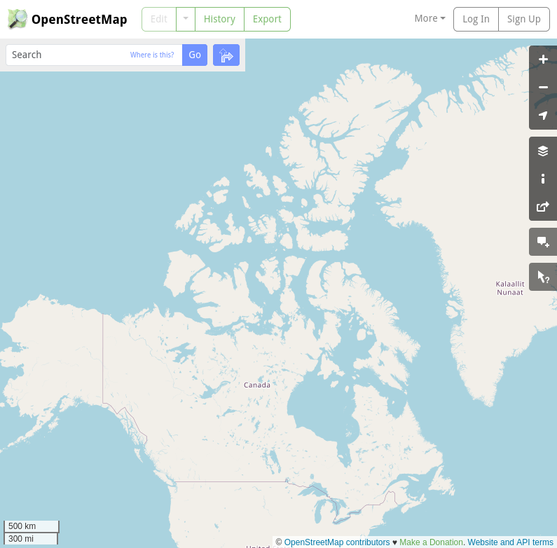
Maps represent data that includes, or implies, location information. Bring up the OpenStreetMap website in your browser and look at the hyperlink it provides. In my case, it looks like this:
https://www.openstreetmap.org/#map=3/71.34/-96.8
Those numbers at the end (in my example: 71.34 and -96.82) are the latitude and longitude of the land mass shown in the center of the screen.
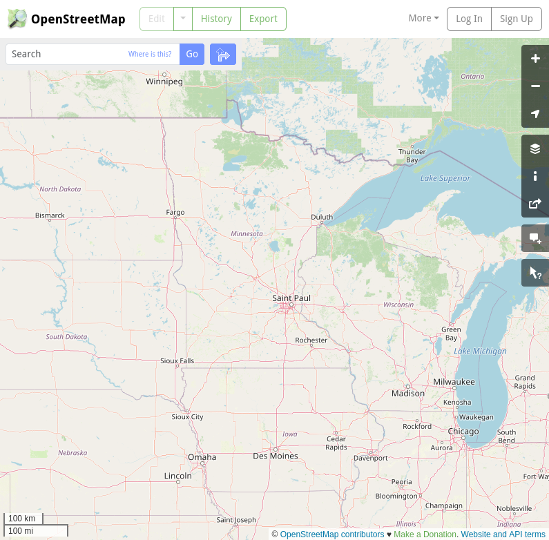
Put your mouse on the screen over the land or water; you should see the mouse pointer transform into a hand, which you can use to grab—by clicking and holding down the left mouse button—the point over which you are hovering and drag it to some other spot. You can also use your mouse wheel to zoom further in or further out on the map. With a bit of zooming and dragging, I can get Saint Paul, Minnesota in the center of my map window. At this point, those numbers shown in the browser navigation bar should look something like this:
https://www.openstreetmap.org/#map=6/45.290/-93.647
We can also see that Rochester is southeast of Saint Paul; Duluth is north-northeast, and so on.
We can think of these locations as a particular kind of map data or point data, and the website is transforming that point data from the latitude and longitude locations (in decimal degrees) to pixel locations on the screen. This type of transformation (for example, from latitude-longitude position to pixel position) is a map projection.
Now fiddle around some more with zooming and dragging until you have Saint Paul again located near the center of the screen, with Fargo, North Dakota shown in the upper left and Milwaukee, Wisconsin shown in the lower right. As you compose this view, you are working on the map layout. A map layout is a combination of all the themes (cities, roads, water, states, provinces, etc) that are shown on the map, plus the way in which those themes are shown: roads as red lines, cities below a certain size as small circles… as well as the visual priority of these: labels over lines over areas, the sizes of text, what is named, what is the scale (one cm on the screen equals one km on the Earth), and so forth.
OpenStreetMap determines quite a bit of this map layout for you, but in the toolbar on the right side of the screen there is a tool to select "layers" of spatial data, such as the transportation group of layers.
Applications such as OpenStreetMap are wonderful ways to explore map data by zooming and panning and selecting layers, but they only go so far. A cartographer who wants to be in complete control of their map data, projection and layout needs to use the mapping capabilities provided by a geographic information system.
What are typical usage restrictions or acknowledgements?
Notice the "Copyright" menu item on the top bar of the OpenStreetMap website. If you click on that and read over the Copyright and License information, you'll note the terms of use allowed by OpenStreetMap, especially this paragraph:
You are free to copy, distribute, transmit and adapt our data, as long as you credit OpenStreetMap and its contributors. If you alter or build upon our data, you may distribute the result only under the same license. The full legal code explains your rights and responsibilities.
—from the OpenStreetMap Copyright and License document
Almost all map data and maps have some kind of licensing agreement attached to them. Maps themselves are usually covered under copyright law, in the same way textual information is. Map data is often provided subject to terms of licensing, in the same way software is. While copyright is pretty straightforward, licensing agreements can be convoluted to the point of incomprehensibility. Moreover, someone who obtains data under the licensing agreement available in 2015 needs to be aware of any clause in that agreement that binds the user to tracking future changes to the licensing agreement.
Cartographic standards and best practices
Many organizations that produce maps also provide documented standards for map production within their organizations. For example, the US Federal Geographic Data Committee, the Geomatics Canada CanTopo Map Standards and Specifications 1:50,000 (PDF) or the EU Statistical Cartography 2022 standards document all provide useful guidelines for cartographic standards and mapping best practices, and there is an endless list of other authorities.
In terms of a general introduction to cartography, the book Elements of Cartography (6th edition, by A.H. Robinson, J.L. Morrison, P.C. Muehrcke, A.J. Kimerling and S.C. Guptill, 1995, John Wiley & Sons) is arguably the classic reference work on cartography.
Other map-making tools
There are quite a number of tools useful in the process of map-making. Probably the two most obvious suggestions are QGIS - A free and open source geographic information system, and ESRI ArcGIS. Many organizations that collect and manage their own data and create maps and other geographic data visualization products use ArcGIS, as ESRI was the first generally useful geographic information system and has maintained a leadership position in the field ever since. However, QGIS is extremely capable, has a strong developer and user community and a great deal of reference material available, and is certainly a viable alternative to ArcGIS.
Some professional cartographers use tools such as Adobe Illustrator to produce final published maps based on output from a geographic information system.
Organizations with a substantial interest in managing their spatial data—for example, by maintaining an up-to-date central database—will select a spatially-enabled database management system, such as PostgreSQL with the PostGIS extension for this purpose. This kind of spatial database also provides geometry and geography functionality as part of the query language, permitting scripting of complex queries that incorporate location information into the analysis process. Some idea of the scope of these kinds of analysis can be gained by reviewing the standards published by the Open Geospatial Consortium.
Maps help readers understand data
Map-making today can be as simple or as sophisticated as the map-maker may desire. But doing anything beyond visualizing well-known information such as transportation, cities, and water bodies, and especially making thematic maps that strongly support a great technical report, can quickly pull the map-maker into the deep end of the cartographic pool.
For university or technical school students, many geography departments provide introductory courses in geographic information systems, which can be a wise investment in a future career in technical communication, particularly as post-secondary institutions usually have access to a range of open source and commercial software that would be difficult to assemble on one’s own.
For those who want to learn on their own, I recommend following A Gentle Introduction to QGIS, since both the course and the software require no investment beyond the time taken to install the software and proceed through the lessons.
No matter the approach taken, the other important aspect of map-making is finding the data needed to support the work. Countries, states, cities, governmental organizations and NGOs offer a bewilderingly large range of data that may seem relevant, and only careful examination will prove whether the data is fit for purpose.

Chris Hermansen Seldom without a computer of some
sort since graduating from the University of British Columbia in 1978,
I have been a full-time Linux user since 2005, a full-time Solaris and
SunOS user from 1986 through 2005, and UNIX System V user before that.
On the technical side of things, I have spent a great deal of my career as
a consultant, doing data analysis and visualization; especially spatial
data analysis.