 Comparing my favorite fonts
The font you use in your documents can provide a classic feel or evoke a more modern approach. Here are a few favorites.
You can find many fonts out there to use in your documents. Your system probably comes with dozens of pre-installed fonts, and you can download additional fonts from places like Google Fonts or Adobe Fonts. Here are a few of my favorite fonts that I like to use, and when I like to use them.
What is a serif
Before we compare fonts, we need to understand a term about fonts. Fonts can either be serif or sans-serif. If you don't know what a serif is, it's the little "tag" that juts out from the edges of certain fonts. Literally, the word sans-serif means "without serif," so you can find examples of sans-serif fonts by looking for fonts that don't have that little tag. A classic example of a serif font is Times New Roman, and a typical sans-serif font looks like Arial.
Look at the uppercase word MITTEN, written in both a serif and sans-serif font:

The top sample is written in a sans-serif font, and the bottom in a serif font. See the extra "bits" that fly out from the edges of the font in the bottom sample? Those are the serifs in the font.
Serif fonts
Serif fonts have a classic feel that can suggest "established" and "stable." Some also prefer serif fonts for printed materials because they find serif type easier to read, especially at small sizes. Here are the serif fonts I use most:
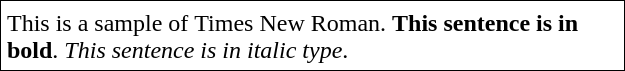
Times New Roman is a workhorse in office environments. As its name might imply, it derives from the Times font, which was frequently used in printed newspapers. These days, you often find Times New Roman as the default font in student papers:
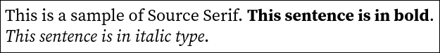
I like to use Source Serif as a modern alternative to Times New Roman. Source Serif shares evokes the same classic feel of Times, but I like the look of Source Serif for my printed materials:
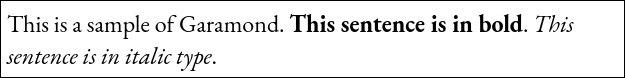
Garamond is a classic font that's been around forever. Before the era of electronic fonts, Garamond was one of the most common fonts used in traditional printing. Garamond and its variants have been used in old printed books and many journals. Garamond is very readable in its roman style, but I find the italic type more difficult to read:
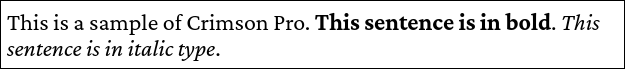
Crimson Pro is a variation of the Garamond font family, and I really like how it appears both in roman and italic style. While I don't use italic type for long sections of text, it's nice to have a font like Crimson Pro where I know italic text will remain easily readable:
Sans-serif fonts
Others like sans-serif fonts because they provide a hint of modernism. I also use sans-serif fonts as a counterpoint for serif fonts, such as serif fonts for body text and sans-serif for titles and headings.
Arial Narrow is a nice alternative to the standard Arial font. I prefer Arial Narrow when I need to display big text such as titles and headings, because the narrow appearance doesn't look quite so imposing at larger type sizes:

Source Sans is a great font that provides a clean appearance for a variety of text. I use Source Sans for all kinds of documents; it works equally well at "normal" sizes such as body text, at larger sizes for titles and headings, and at smaller sizes such as captions and page footers.

A matter of preference
What font you use in your documents is often a matter of personal preference. A serif font can bring an air of professionalism to a printed document. A sans-serif font can suit other needs, such as a clean look in captions and labels.
Explore the fonts available to you and share your favorites.

Robin Bland is a technical writer in the Minneapolis/St Paul area.