 Creating accessible Microsoft Word documents
Use these tips to make sure everyone can read what you’ve written.
This Thursday is Global Accessibility Awareness Day, and this can be a good reminder to create accessible documents. One common tool in technical writing is the word processor - and when you create content using the word processor, you should be sure to follow a few key steps to ensure everyone can access the content you’ve written. These are the tips we follow to create accessible documents using Microsoft Word:
Create a structure using document styles
You might think, “hey, Word documents are just a quick document” and then just use basic formatting like bold and italics to get the job done. But that’s a shortcut that will lead to inaccessible documents. Word has pretty rich support for paragraph styles. These are excellent if you need to write a long document and want to make sure that how you’ve styled a section heading on page 1 is the same way you’ve styled the same level of section heading on page 28, or on page 99.
Document styles have a more practical benefit for screen readers, too. A screen reader is an assistive technology that can “read out loud” what’s on the screen so someone can understand what’s there. For Word documents, screen readers rely on the paragraph styles to point to what that content is supposed to be. Is this a document title? Is this a heading? Is this a body paragraph?
Use styles across your entire document. If you’re using Word on the Web, you may need to enable the Classic Ribbon to see it, but you will be able to use the toolbar to set the styles for any paragraph in your document.

Add alternate text to images
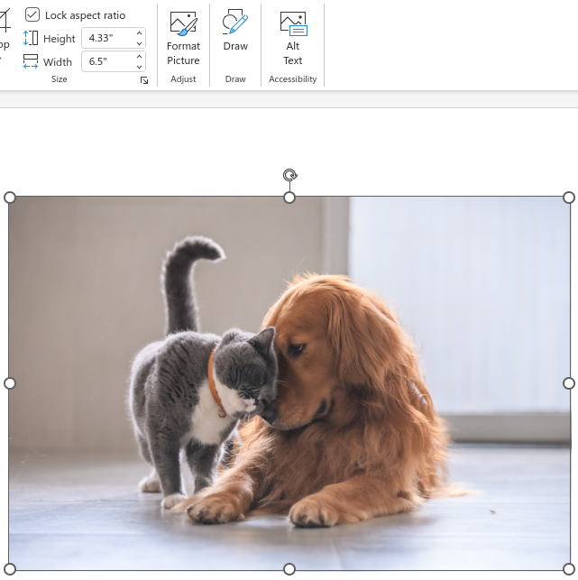
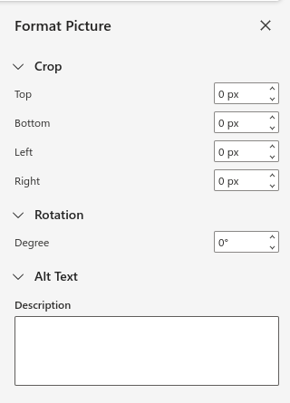
Images aren’t just decorative. In a professional document, images are often very important, such as diagrams or charts, and sometimes photos. When you add an image to a Word document, you should find yourself in the Picture part of the Ribbon, which allows you to control things like the picture style (such as border, shadow, and so on) and change the height and width. Further along the Ribbon, you should see a button for Alt Text.

The Alt Text in a Word document serves the same purpose as “alt text” in an HTML image: it provides an additional description that the screen reader can read out to the user. Don’t skip this, and don’t make it some simple text like “photo” or “chart.” Actually put a description of the photo or or image in there, so someone who can’t see it will be able to understand what the image is, based on the description you provide. For a complex image like a chart, you might need to write more - such as a description of the chart and the trends that are in the chart.

Give document links a meaningful name
Often, a document will need to provide a link to a website. This is very useful to anyone who is reading the document online; obviously, that’s not very helpful if you print it.
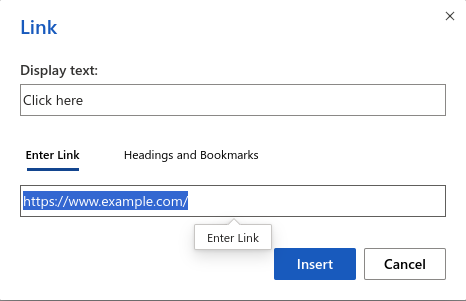
The link text needs to be descriptive in some way. My personal pet peeve for links is “click here” because that doesn’t mean anything. It doesn’t mean anything to me, even when I can see it. Instead, provide a meaningful description of the link for your link text. You may need to creatively rewrite the sentence with the link so the new link text makes sense in context with the rest of the paragraph. For example, rather than “click here for the standard procedures,” you could rewrite that as “for more information, please read the standard procedures document available to you in the HR folder.”

Keep an eye to accessibility
It’s too easy to forget accessibility when we create documents. Especially if we’re in a hurry to get something done, it can be tempting to save a bit of time and take a shortcut. But those shortcuts aren’t fair; they are harmful to the community. If people can’t read what you’ve written for them, or if you’ve created a document that only some people can read (people with vision) then you’ve actually disenfranchised everyone else.
So as you create documents, keep an eye to accessibility. Use document styles, add Alt Text to images, and always write document links so they make sense in context.
