 5 cautions about web accessibility
Avoid these common accessibility errors when designing your website.
This week, we celebrate Global Accessibility Awareness Day. This is a day to recognize the importance of accessibility for everyone on the web, and creating content that is accessible to everyone. Accessibility means creating content in a way that everyone can access it on a level playing field. The web is not just for those with vision; everyone should be able to access the web.
As technical communicators, if we create content that someone else cannot access because of their disability, that's on us, the people who made the content. Common disabilities include vision, hearing, motor, and cognitive—but don't forget situational disabilities, such as temporary colorblindness because your device is in "bedtime" mode, which turns everything into black and white.
Let's look at a few examples of poor accessibility and how to avoid them. All of these screenshots were taken with a Pixel phone, with "larger text size" accessibility features turned on. While the resolution of the phone is much larger, I have resized these images to 330 pixels wide, to show them in a more accurate size.
1. Hidden links
One website that has poor accessibility is OpenSource.net, the public blog of the Open Source Initiative. The original design of OpenSource.net used a dark green theme with black text and dark green links.
One accessibility issue with the old design was the links were not underlined, which made the website difficult for colorblind users to navigate. Dark green becomes a dark gray, almost black, when viewed in grayscale, which is indistinguishable from the body text.
The Open Source Initiative recently updated the OpenSource.net website design, but unfortunately the links are still not underlined. The links are now bright blue, which renders them as a medium gray for colorblind users.
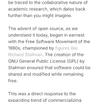
Accessibility tip: Always use underlined links, especially in body text. This will ensure that website links can be used by everyone, including those without color vision.
2. Tiny logos
A website's logo is the key to its brand; it's how users identify the website as what it is. The website logo should always be clear to everyone who views it.
Unfortunately, the OpenSource.net logo becomes almost invisible when viewed on a mobile device. The "OpenSource.net" text part of the logo is effectively only 8 pixels tall and 60 pixels wide. Even on a high resolution display, this is too tiny to be read. Fortunately, the image provides alternative text as alt="OpenSource.net" for screen readers, but users with diminished vision are left unable to view the logo.
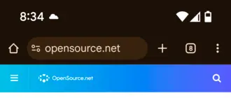
Accessibility tip: Ensure that your website logo is clear and easy to read. Images like logos must always include alternative text for screen readers, but they must also be displayed large enough so that users with vision can see it.
3. Low contrast text
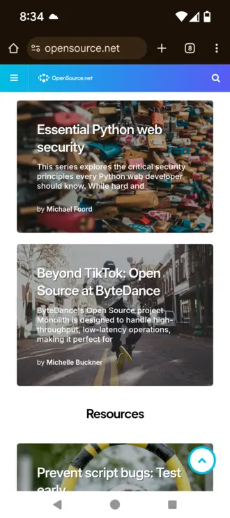
As the Global Accessibility Awareness Day website highlights, the most frequent accessibility issues on websites today is low contrast text (86% of websites), and the OpenSource.net website is no exception. The top "highlight" article on the website is about "Getting Started with Open Source" and the summary text is written in a light gray on a white background.
The W3C's Web Content Accessibility Guidelines (WCAG) requires a minimum contrast of 4.5:1 for body text. Yet this text is #93979F (light gray) against #FFFFFF (white), which has a 2.92:1 contrast ratio, much too low for body text. This will be unreadable to users who have low contrast vision. I wear glasses but otherwise have good vision, and even I have difficulty reading this text.
Accessibility tip: Avoid low contrast colors for text. For example, #000000 (black)on #FFFFFF (white) has the highest contrast ratio at 21:1, although some users may find that too high contrast for comfortable reading. Instead, #333333 (dark gray) against #FFFFFF (white) has a 12.63:1 contrast ratio, which is excellent for all users.
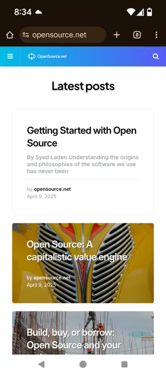
4. Text over images
News websites and blogs often include images, such as photos, as part of an article's title. This draws readers' attention and makes the article headlines "pop." This is especially effective if the photo is of a person that the audience will recognize.
However, be careful not to put text on top of an image. This makes the text difficult to read for several reasons: White text on a light background, such as a light part of the photo, is too low contrast for some readers. Also, this "busy-ness" of the title is a challenge for some readers with cognitive disabilities.
On the OpenSource.net website, the article summary text for several of the articles seem to disappear into the "noise" of the background photos. The headlines are not too bad, but the article summary text is effectively unreadable.
Accessibility tip: Don't place text on top of images. For "hero" images like these, place the text above or below the image. This will make your website easier for everyone to navigate.
5. Hidden text
Web designers like to use "floating" navigation links to make it easier for users to jump back to the top of the website. This is well intentioned, because it is meant to help users return to the top of the page.
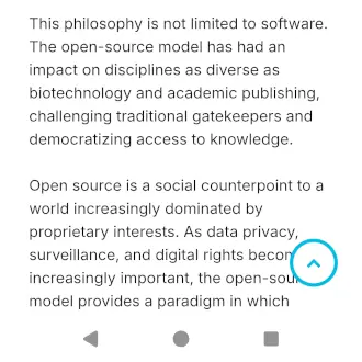
However, be careful that your icons do not cover other text on the website. For example, the OpenSource.net website uses an "up chevron" icon that floats over the text, but also covers part of the text in the disclaimer at the bottom of the page:
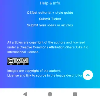
This problem is made worse in articles on the website, where the "up chevron" icon covers up part of the article content:
Accessibility tip: Be careful when adding "floating" icons that might cover part of your website's content. If you must use these "floating" icons, ensure they are placed near the edge of the screen, and that your content has a large enough margin on that side to avoid text appearing "under" the icon.

Jim Hall is an open source software advocate and technical writer. At work, Jim is CEO of Hallmentum, an IT executive consulting company that provides hands-on IT Leadership training, workshops, and coaching.