 Font pairings for print
Use this handy guide to pair the right heading font and body font to suit your next print project.
I am researching a new book, and I want my final product to look great. There are many great fonts to choose from to create book interiors, but I wanted to find a font combination for chapter titles and section headings, with body text, so the book will have a professional yet classic look.
For example, is Times the best font for body text, or would my book interior look better using Palatino? And for the headings, should I use Helvetica or ITC Avant Garde? Which heading fonts pair best with which body fonts? I decided to create a mix of several great fonts for print, combining fonts that are great for body text, and fonts that are best used for headings.
Using ‘groff’ to test fonts
I'm not writing my book in groff, but groff provides excellent fonts intended for print, so I started there. Using the fonts in groff as my guide, I created a sample of fonts for body text and headings. If you haven’t used groff, it is a modern version of the classic nroff and troff document processors from Unix. nroff came first, and generated output suitable only for typewriter-like devices. Later, Unix added troff with support for fonts and other special formatting available on phototypesetters of the era. In the 1990s, the GNU Project created groff, the Free software equivalent to troff, which supported all the features of Unix troff, plus new features not available in troff.
groff includes several default fonts that work well for print projects. The /usr/share/groff/current/font directory has subdirectories for each output type, including devps for PostScript and devpdf for PDF files. Since I’ll need to generate PDF output, I used PDF fonts for this experiment - but it turns out that both devps and devpdf hold the same fonts, except that ITC Zapf Dingbats exists only in devps. My project won’t use dingbats characters, however.
Each file is named with one or two letters for the font name, plus R for roman type, B for bold, I for italic, and BI for bold-italic:
$ cd /usr/share/groff/current/font
$ ls devps/*R
devps/AR   devps/CR   devps/HR  devps/PR  devps/ZDR
devps/BMR  devps/HNR  devps/NR  devps/TR
$ ls devpdf/*R
devpdf/AR   devpdf/CR   devpdf/HR  devpdf/PR
devpdf/BMR  devpdf/HNR  devpdf/NR  devpdf/TR
What are these fonts
Each font file is plain text, and starts with a comment block with information about the file, then a description of the metrics for each character in the font. Because the files are plain text, we can use the command line to look for the FullName entry in the comment block, to tell us the full name of the font:
$ grep FullName devpdf/*R
devpdf/AR:#   FullName ITC Avant Garde Gothic Book
devpdf/BMR:#   FullName ITC Bookman Light
devpdf/CR:#   FullName Courier
devpdf/HNR:#   FullName Helvetica Narrow
devpdf/HR:#   FullName Helvetica
devpdf/NR:#   FullName New Century Schoolbook Roman
devpdf/PR:#   FullName Palatino Roman
devpdf/TR:#   FullName Times Roman
ITC Avant Garde is a sans-serif font that is most often used in headings. Its round shapes provide a distinctive look - although that same feature can cause eye strain if used in body text.
ITC Bookman is a serif font that can be used in body text or headings, but is more frequently found in headings. Bookman has a slightly bold appearance, which also makes it an excellent candidate for advertising copy.
Courier is a typewriter-like font, also called a monospace font. It is typically used to format code samples in a document.
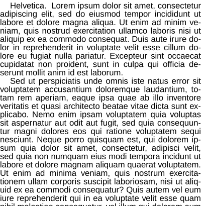
Helvetica is a classic sans-serif font that is familiar to many modern readers. The narrow version of the font is more frequently used for headings, while the standard font can be used for either headings or body text.
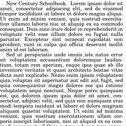
New Century Schoolbook is a serif font, frequently used in body text. Its old-style appearance lends it a classic look that is very readable.
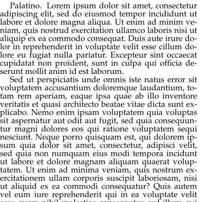
Palatino is a popular serif font for print projects, usually in body text. It also has an old-style feel that works well in a variety of font sizes.
Times is a classic serif font, often used in academia. It originated in newspapers, hence the name.
Creating font samples
The simplest way to generate a combination of different fonts for headings and body fonts is to create a sample paragraph in each font style best used in body text, and a sample title with each heading font. Once I generated sample PDF output with each, I loaded the files into an image editing program such as GIMP to crop the images to a standard width and height. This allowed me to mix and match the heading fonts with the body fonts, to see which pairing I liked best.
To generate the body text, I created three line groff files for each of the four fonts that work best in body text: Helvetica, New Century Schoolbook, Palatino, and Times. Each file had a .fp instruction that defined a font file as font position 1, then a .ft instruction to set the text to that font position. The last line contained the name of the font itself. For example, the file for Times (body-t.tro) looks like this:
.fp 1 TR
.ft 1
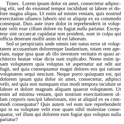
Times.To define the first paragraph, I used this text in a file called body.tro:
.ps 12
.ll 4i
.ti .2i
I also saved two paragraphs of the standard Lorem Ipsum text in a new file called lorem.tro:
Lorem ipsum dolor sit amet, consectetur adipiscing elit, sed do eiusmod
tempor incididunt ut labore et dolore magna aliqua. Ut enim ad minim
veniam, quis nostrud exercitation ullamco laboris nisi ut aliquip ex ea
commodo consequat. Duis aute irure dolor in reprehenderit in voluptate
velit esse cillum dolore eu fugiat nulla pariatur. Excepteur sint occaecat
cupidatat non proident, sunt in culpa qui officia deserunt mollit anim
id est laborum.
.ti .2i
Sed ut perspiciatis unde omnis iste natus error sit voluptatem
accusantium doloremque laudantium, totam rem aperiam, eaque ipsa quae
ab illo inventore veritatis et quasi architecto beatae vitae dicta sunt
explicabo. Nemo enim ipsam voluptatem quia voluptas sit aspernatur aut
odit aut fugit, sed quia consequuntur magni dolores eos qui ratione
voluptatem sequi nesciunt. Neque porro quisquam est, qui dolorem ipsum
quia dolor sit amet, consectetur, adipisci velit, sed quia non numquam
eius modi tempora incidunt ut labore et dolore magnam aliquam quaerat
voluptatem. Ut enim ad minima veniam, quis nostrum exercitationem
ullam corporis suscipit laboriosam, nisi ut aliquid ex ea commodi
consequatur? Quis autem vel eum iure reprehenderit qui in ea voluptate
velit esse quam nihil molestiae consequatur, vel illum qui dolorem eum
fugiat quo voluptas nulla pariatur?
The .ps 12 instruction sets the font size to 12 points, and the .ll 4i command defines a line length of 4 inches. This gives short paragraphs, but I didn’t need wide paragraphs anyway to test font pairings. Each paragraph starts with .ti .2i which provides a 2/10 temporary indent.
I also defined one other file called page.tro with the page dimensions, using .po 0 to define a zero left margin (“page offset”) and .sp 0 to have zero spacing at the top of the page. While these are not appropriate settings for a print project, they produced output that made it easy to crop consistently in an image editing program.
Using separate files that just defined certain parts of the text, such as font or page settings or body text, allowed me to combine them and process them through groff. With these files, I created PDF files of each body text sample:
$ mkdir out
$ for b in body-*.tro; do cat page.tro body.tro $b lorem.tro | groff -Tpdf > out/${b%.tro}.pdf; done
I used a similar method to create one-line samples of the heading fonts I was interested in: ITC Avant Garde, ITC Bookman, Helvetica, and Helvetica Narrow.
Font pairing samples
With these font samples, let’s compare how each 14-point heading font looks with each 12-point body font. Each heading font sample and body font sample are separate images, and are combined here using HTML image references. The body text is cropped into a 410x410 square, and headings are cropped into a 410x44 pixel rectangle. The headings don’t actually require 44 pixels of height, but the extra space simulates typical spacing between headings and body text. Note that some body text samples are cut off because I was only interested in a consistent square body image; I didn’t need to see the full body text sample to see how well it paired with the heading font.
Helvetica as body text


New Century Schoolbook
Palatino
Times
Which do you like best?
Generating these combinations of headings and body text allows me to compare which font I think will go best with my project. For my book project, I prefer a serif font for body text, with a sans-serif font for headings. Palatino has a very readable appearance that I think will work well for my body text, while ITC Avant Garde has a distinctive appearance for headings that shouldn’t be overpowering if used only for chapter titles and section headings.

Jim Hall is an open source software advocate and technical writer. At work, Jim is CEO of Hallmentum, an IT executive consulting company that provides hands-on IT Leadership training, workshops, and coaching.