 GNOME usability test for media applications
The GNOME Project shares these usability test results for enhancing user experience across Decibels, Loupe, and Showtime.
As part of our outreachy internship program on the GNOME Community Udo Ijibike and Tamnjong Larry (myself) under the guide of our mentors Allan Day and Aryan Kaushik conducted usability tests to evaluate the user experience across three media applications: Decibels (Audio Player), Loupe (Image Viewer), and Showtime (Video Player). Our goal was to identify areas for improvement and enhance the overall usability of these applications to better align with users' natural workflows.
In light of the research objective, we sought to answer questions about:
- How intuitive is it for users to navigate and use the core functionalities of each application?
- What challenges do users face when interacting with gesture controls and other interface elements?
- How well do the applications meet users' expectations for media interaction?
Test Participants
For this study, we recruited five participants from across the world who were GNOME users but had not used any of the media apps before the study. The participants were from diverse works of life from software developers, students, and a medical doctor, just people who use GNOME regularly. The participants were recruited through social media posts on GNOME's official channels on Twitter and Mastodon.
Testing Environment
Method: We conducted remote moderated usability tests using the gnome meet conferencing tool, which allowed participants to share their screens and complete tasks while we observed and provided prompts, guides, and follow-up questions.
Test Duration: The testing sessions spanned five days, with each session lasting approximately 40 to 50 minutes.
Task Scenarios: Participants were given specific tasks to complete in each application, these tasks were designed to test key functionalities:
Decibels:
- Opening and playing audio files
- Adjusting playback speed
- Seeking a particular point in a track using the waveform
Loupe:
- Opening and viewing images
- Rotating images
- Zooming in on images, and navigating the properties sidebar
Showtime:
- Opening and playing video files
- Switching subtitles
- Adjusting the volume, entering and exiting full-screen mode, adjusting video volume and playback speed
Outcome and Data Collection
We collected both quantitative data (task completion rates and number of attempts) and qualitative insights (user feedback and observed behaviors) for all three media apps.
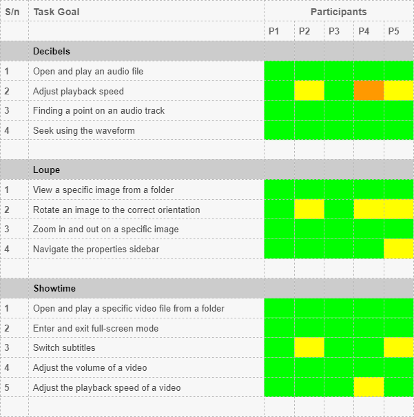
We used Jim Hall's heat map technique to summarize our usability test results. The heat map clarifies how easy or difficult it was for participants to accomplish tasks: Green if the tester easily completed the task without any difficulty, yellow if the tester completed the task with very little difficulty, orange if the tester completed the task with some difficulty and had to poke around for solutions, red if the tester completed the ask with severe difficulty, and black if the tester was unable to complete the task and gave up.


The heat map table above provides an overview of the entire study.
For this analysis, I will focus on the areas highlighted in yellow and orange, which indicate where users encountered challenges while using the apps. The heat map mostly has green blocks which means participants accomplished most of the tasks with no difficulty. We don’t have any black or red blocks meaning no participant was unable to perform or faced a critical difficulty while performing their task.
The labels P1 to P5 correspond to the participants (Participant 1, Participant 2, and so on). Below the participant row, each app is listed along with tasks associated with that app. The tasks are numbered 1, 2, and so on. Each block below the participants' row represents the app, the task, and the level of difficulty or ease with which the user completed the task.
Looking at the heatmap we can see that:
- 3 out of 5 participants faced some challenges adjusting the playback speed in Decibels
- 3 out of 5 participants faced some challenges rotating images in Loupe
- 1 out of 5 participants faced some challenges navigating the properties sidebar in Loupe
- 2 out of 5 participants faced some challenges switching subtitles on Showtime
- 1 out of 5 participants faced some challenges adjusting the playback speed in Showtime
Qualitative Observations and Insights
In the next section, we will look into the insights of these challenges faced by participants.
Decibels
Adjusting Playback Speed
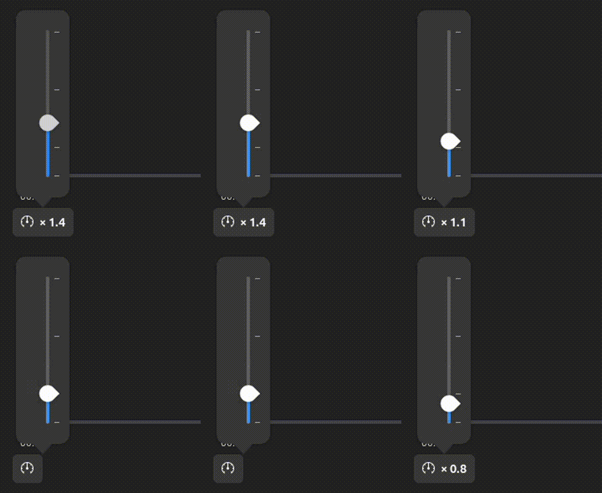
Although some participants recognized the speedometer icon as representing speed controls, at least one participant mistook it for a performance-related icon.

3 participants faced challenges adjusting the playback speed due to unclear controls and a lack of clear visual feedback when moving from one speed level to another.

Key Challenges:
- Lack of clear descriptions for the various playback speed control levels.
- Difficulty in confirming the set playback speed due to insufficient feedback.
Participant Feedback:
- "The icon for playback speed controls seems to look like an icon for performance."
- "The playback speed controls do not have descriptions, so I do not know the exact speed I'm changing to."
Recommendations:
- Add clear labels to each speed control point for better clarity when adjusting playback speed.
Waveform Interaction
Overall all participants were able to use the waveform accurately to identify silent points in the audio track.

One participant expected to use standard two-finger gestures for zooming in and out of the waveform display but could not because the waveform does not have zoom functionality.
Also, another participant found the interaction between the waveform and the audio speed to be out of sync; the participant expected the waveform movement to synchronize with the audio speed, which they perceived was not the case.
Key Challenges:
- Inconsistent gesture controls for zooming.
- Unsynchronized waveform movement, creating a perception of lag.
Participant Feedback:
- "I would just like to see the waveform be smoother. The sensation here is that the app is slow when I see this."
Recommendations:
- Implement zoom gesture support for waveform viewing so users can zoom out and view the waveform for the entire track rather than for short sections.
- Ensure the waveform better synchronizes with the audio track.
Loupe
Rotating Images
Three participants had difficulty finding the image rotation buttons in Loupe. Unlike similar image viewers where these buttons are typically more visible, Loupe requires users to access the 'Main Menu' to find them.

The participants found it unnatural to have to click a menu to access the rotation buttons. On average, it took them two attempts to locate the buttons, primarily through trial and error.
Additionally, one participant expected a film-strip like behavior with images when navigating between images with the arrow keys on the keyboard.
Lastly, another participant noted that floating (overlay) buttons disappeared too quickly, making interaction difficult.

Key Challenges:
- Rotation buttons were not prominently displayed or easily accessible.
- The quick disappearance of overlay buttons led to a frustrating user experience.
Participant Feedback:
- "Since the rotation buttons are not part of the floating (Overlay) buttons, I will click the menu for options."
- "The floating buttons hide very quickly. I expect them to stay a bit longer."
- "I do not like the fact that there's not a wrap around the images when navigating with the arrow keys"
Recommendations:
- Make rotation controls more prominent and easily accessible, possibly as part of the overlay buttons.
- Extend the visibility duration of overlay buttons.
Showtime
Switching Subtitles
One participant found it difficult to locate the subtitle control in Showtime, as it was hidden within the settings menu. This made it difficult for the participant who frequently uses subtitles and expected the control to be more accessible.

Key Challenges:
- Subtitle controls were not prominently displayed, leading to confusion and difficulty.
Participant Feedback:
- "I usually watch videos with subtitles and I use them frequently, so I expect the subtitles button to be more in the open."
- "Since I cannot find the subtitles controls, I will assume it is in the settings."
Recommendations:
- Make subtitle controls more visible and easily accessible.
Reflection
Throughout the study, all users completed all tasks, despite facing minor challenges or needing more than one attempt to complete some task. Overall, the apps are user-friendly, and users can easily navigate them. However, the minor issues we identified indicate that there's still room for improvement.
The usability study for the GNOME media apps Loupe, Showtime, and Decibels provided valuable insights but had some limitations. The small sample size of five participants, all of whom were GNOME users, may have limited the diversity of feedback. Including non-GNOME users, as well as participants with varying levels of experience or disabilities, could have offered a broader range of perspectives.
Future research opportunities could involve conducting cross-platform usability comparisons and exploring the accessibility of these apps for users with disabilities.
