 Give LibreOffice a user interface makeover
Explore these user interface options to make LibreOffice look the way you want.
Many people have a first impression that LibreOffice has a "tired" interface. When you run LibreOffice, you probably see the traditional user interface, with menus and the standard toolbar:

But those are just the defaults. You can actually make LibreOffice look quite different, including a "ribbon"-like interface and fancy tabs. The level of customization in LibreOffice is quite impressive; I like that everyone can make LibreOffice look the way they want, to meet their specific needs.
The user interface menu
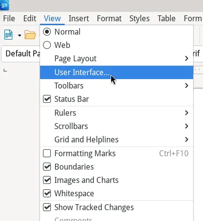
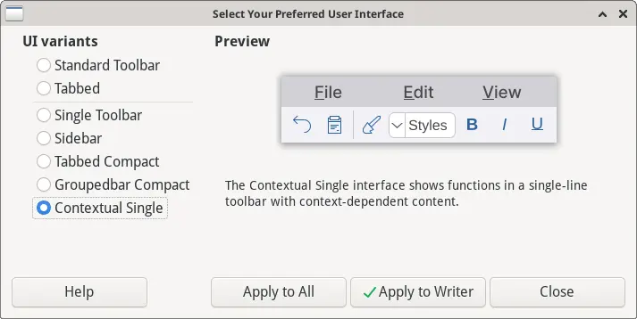
Use the View menu to access the User Interface.. menu. This brings up a window where you can select your preferred appearance.
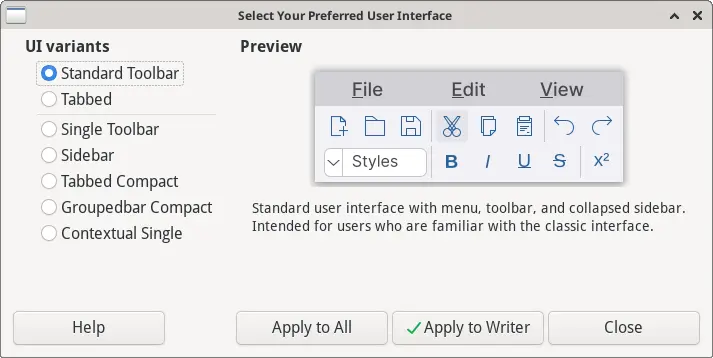
The "Standard Toolbar" interface is the default that you're used to: it has a menu and toolbar, and is good for most general users:
But you have a variety of other interface configurations to choose from! Here are the options you can select from:
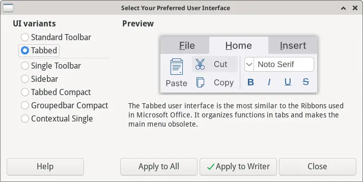
Tabbed
The "Tabbed" interface resembles the Microsoft Office layout, with a "ribbon"-style interface that Office users may prefer.

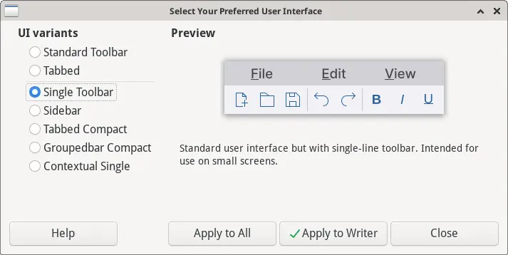
Single Toolbar
If you are running LibreOffice on a laptop with a small screen, such as a "netbook" or similar form factor, the "Single Toolbar" layout may be better for you. This is the standard interface, but made much smaller so it doesn't take up too much screen real estate.

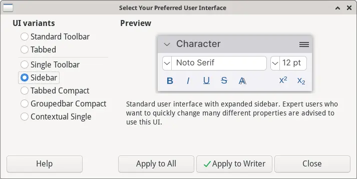
Sidebar
The "Sidebar" interface takes some getting used to, but it's a great layout if you prefer to use styles for everything, and avoid direct formatting. This expands the sidebar with the styles, providing quick access to all paragraph styles, character styles, page styles, and other styles.

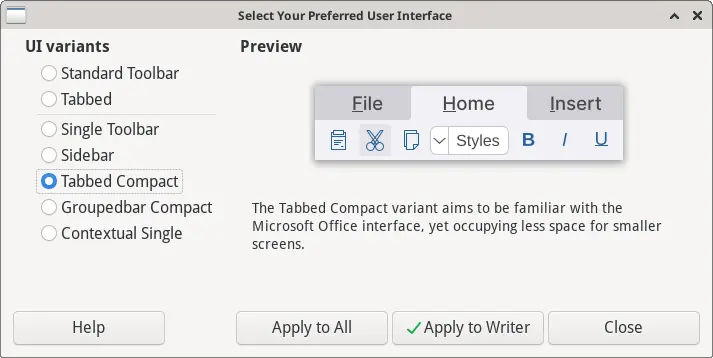
Tabbed Compact
This is similar to the "Tabbed" interface, but intended for smaller screens. If you prefer the "ribbon"-style interface but don't like how much screen space it takes up, try the "Tabbed Compact" user interface layout instead.

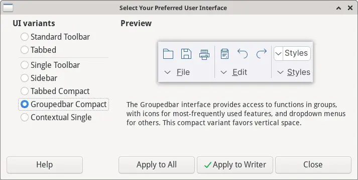
Groupedbar Compact
More experienced users may prefer the "Groupedbar Compact" layout, which organizes the features into groups, using icons and menus. It's an interface that stays out of your way so you can focus on your writing.

Contextual Single
The "Contextual Single" user interface is a modern spin on the classic layout. This mode puts everything into a single toolbar with a menu at the top of the screen.

My preferred layout
When I write books and articles, I use styles for everything, so I can keep my documents looking consistent throughout. That includes using paragraph styles, character styles, and page styles. In fact, I avoid using the B button on the toolbar for bold, instead relying on custom keyboard shortcuts so that ctrl+B changes to Strong Emphasis and ctrl+I changes to Emphasis. I've set other keyboard shortcuts like shift+ctrl+T to apply a code paragraph style, ctrl+T to change to inline code character style, and ctrl+Space to change back to a normal character style.
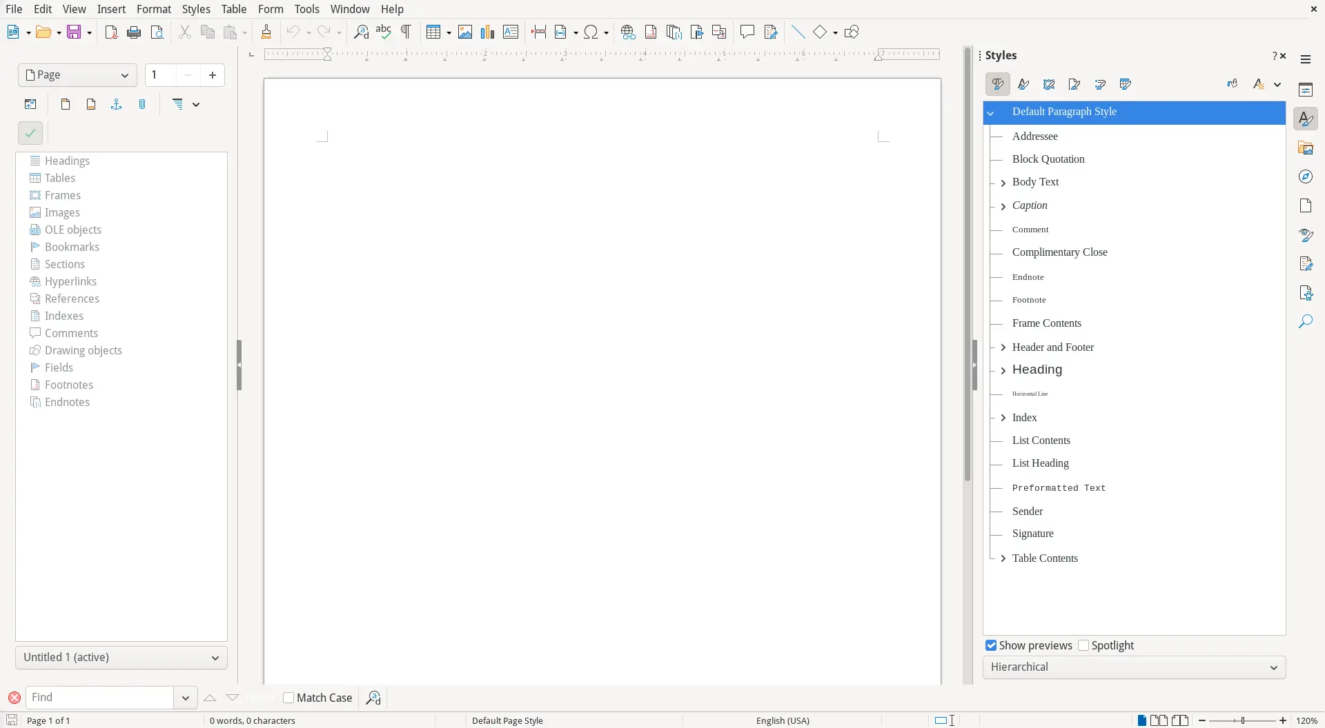
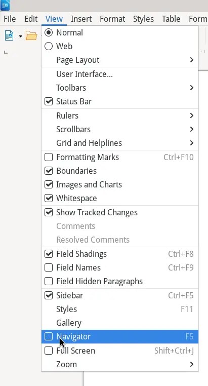
That means I don't need the toolbar at all. I prefer the "Sidebar" style that expands the styles in the right-hand sidebar. I also activate the Navigator, which I find invaluable when I work in Master Documents. To enable the Navigator, use the View menu and select Navigator, or tap the F5 keyboard shortcut:
I like to lock the navigator to the left-hand side of my LibreOffice window, which neatly centers my document and keeps things from looking lopsided:
